


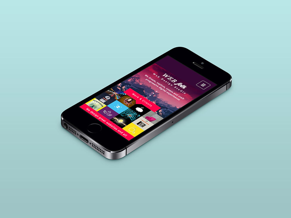
Design for desktop first…
- Novus
- Apr 24, 2023
- 2 min read

Designing a website is a complex process that involves many factors, including the user experience, scalability, SEO, and design flexibility. Whilst there is a growing trend towards mobile-first design, designing for desktop in the first instance still holds several advantages that are worth considering.
Better User Experience for Desktop Users

Designing a website for desktop first ensures that you provide an optimal user experience for desktop users, who still account for a significant portion of overall web traffic. By prioritising desktop design, you can take advantage of larger screen sizes and more powerful hardware to create a visually stunning and feature-rich website. This could include high-resolution images, interactive features, and animations that are not always feasible on mobile devices. In addition, desktop users tend to have different browsing behaviours than—and expectations to—mobile users. They often spend more time on a website and expect a more immersive experience. They’re also more likely to engage with interactive elements. By designing for desktop first, you can provide a better user experience that helps your website stand out from its competitors. Easier to Scale Down for Mobile
Designing for desktop first also makes it easier to scale down for mobile, as opposed to scaling up when you’ve initially focused on a mobile design. Starting with a mobile design can limit your creativity and leave you with a website that lacks certain features or elements when taken to desktop.
This approach ensures that your website provides a consistent experience across all devices, whilst still taking advantage of the unique features and capabilities of each device. It also allows you to prioritise content and design elements that are more important and appealing to your desktop audience, while still making sure that your website is accessible and functional on mobiles. Better SEO

Search engine optimisation (SEO) is crucial for the success of any website. By designing for desktop first, you can create a website with a clear hierarchy, well-structured content and easy navigation—all of which are important for SEO. Desktop websites tend to have more content and pages than mobile websites, which can also improve your SEO. In addition, designing for desktop first allows you to focus on important SEO elements, like metadata, alt tags, and internal linking, which can be more difficult to implement on a mobile website. This can help your business to rank more highly in search engine results pages (SERPs) and drive more organic traffic to your website. Greater Design Flexibility

By designing for desktop first, you can create a visually stunning and immersive website that takes full advantage of all the design elements available to you. It’s then easier to scale this down whilst ensuring that your website still looks great and functions well on smaller screens.
If you’re thinking of overhauling your website, have a chat with us first. We’re a WIX partner and have integrated numerous new functions into websites recently, to the point that it’s difficult to tell our designs apart from household name brands, whose sites have cost thousands upon thousands of pounds to create. Yours would cost peanuts in comparison.
Get in touch with us on 01302578282 or email us at info@novusmarketingsolutions.co.uk

